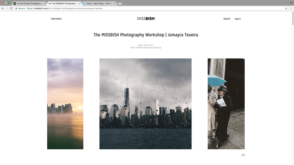
I think this is a simple layout because its quite easy to get your head around and if you click and drag your mouse across you can slide the images across and see more photos . I personally really like the way this website looks. This website has a simplistic look there are 10 photos on the home screen which show the city as its subject if you scroll down the website you get loads of information equipment, location and style. The website shows the photographers style is urban because he dose loads of street scenes. from this website i could use the scroll function to display pictures This photographer has done mainly urban style photos I really like the colours and mood of this image.
You can also find out a lot more information about the photographer. Its quite easy because its all on one page and I like this because it is basic it also says where he is based it even says about what equipment he uses which is really use full to up coming photographers or if you are already it could be quite useful to see what he used because you might want to see what lens he has used or what camera setting.
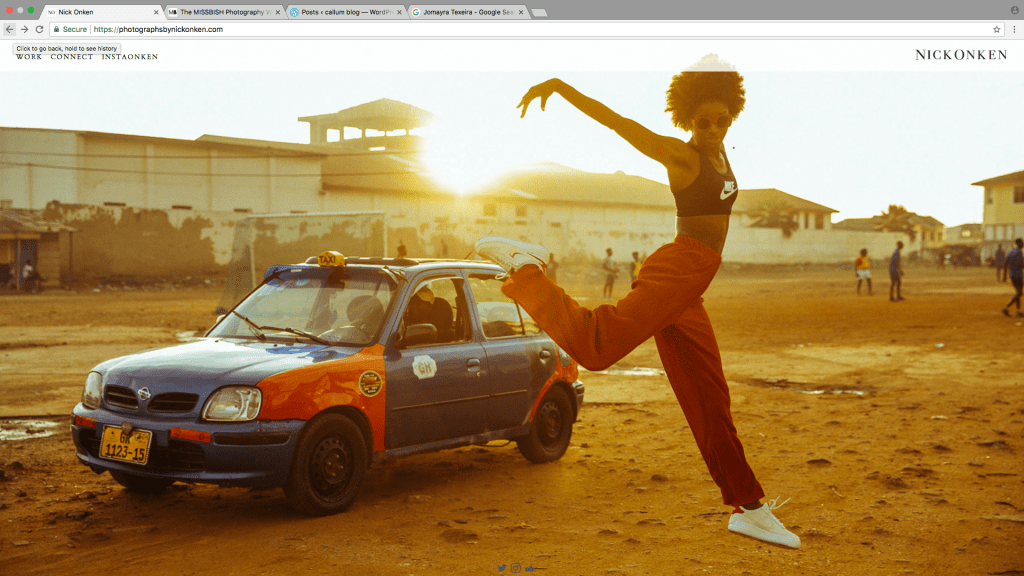
Nick Onken
This is what you see when you first open the site. I like this because it changes through some of the pictures that he took. I like this site because you don’t even have to click on anything. I really like this Idea because it makes his work stand out more because its right in front of you when you load up the page.
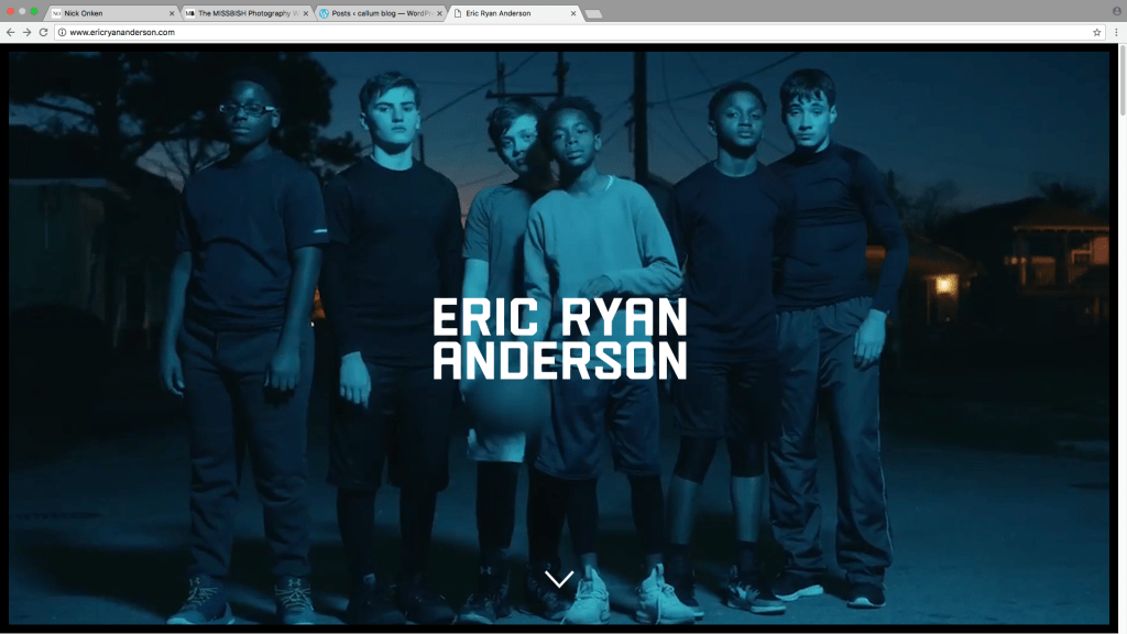
EricRyan
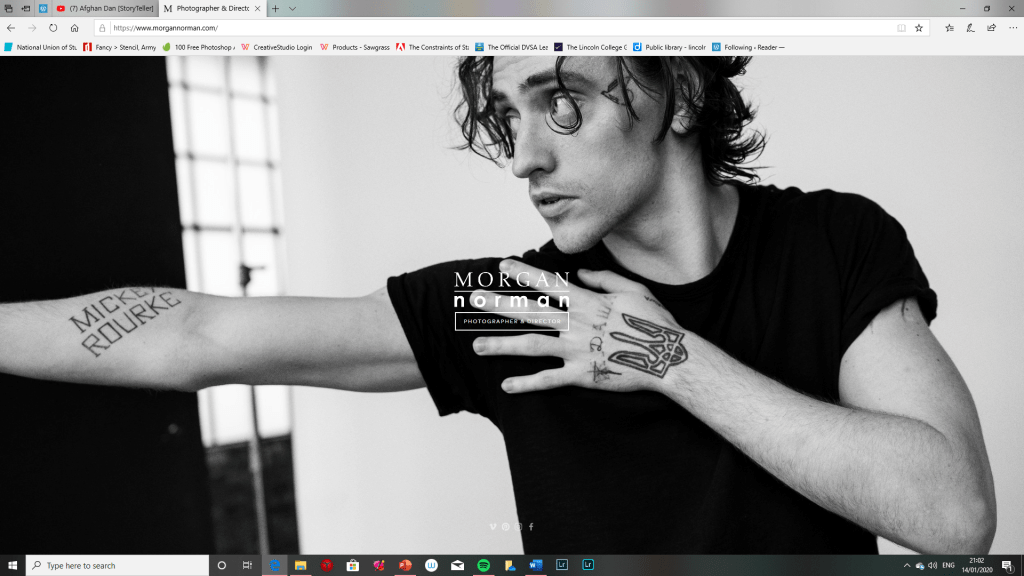
I like this website because he stands out because of the video playing in the background. its like they are in a photo shoot. It is also really easy to use and has information about the photographer and what kind of photography he does. This is my favourite website so far. I also really like the way he has put his pictures in a collage. I also really like the way the images are clumped together but when you click on them they open up into more.Morgan Norman
This website inspires me because of the way it shows of the images I think it was handy to be able to click the image to view more of the same subject and has them all clumped together and categorized. This layout is very simple to use I also think this website is not overly cluttered with information I think this is good because then it will stand out to a wider verity of age groups. I also like how they have hidden all the information behind the main page I think this is really cool because then you just get to see the repeated slide show of images.
My name is Callum and I have an interest in art design graphics and photography. I studied GCSE fine art and graphics and am currently studying for a Level 2 photography diploma at Lincoln College of Art and Design.
I particularly like street photography and urban photography. My current project involves a study of lomography and the use of square format photography along with ways of communicating my photography to the public. You can follow me on Instagram if you're interested in what I post @_rose.lens_