Composition Techniques When Shooting in Square Format
- Make sure you fill the frame.
- Juxta poise squares and circles in the frame.
- If shooting a single subject, centre it or them.
- For portrait shots place the subject’s eyes in the upper third of the frame. Use lines and geometric shapes in your images.
- Make your images symmetrical.
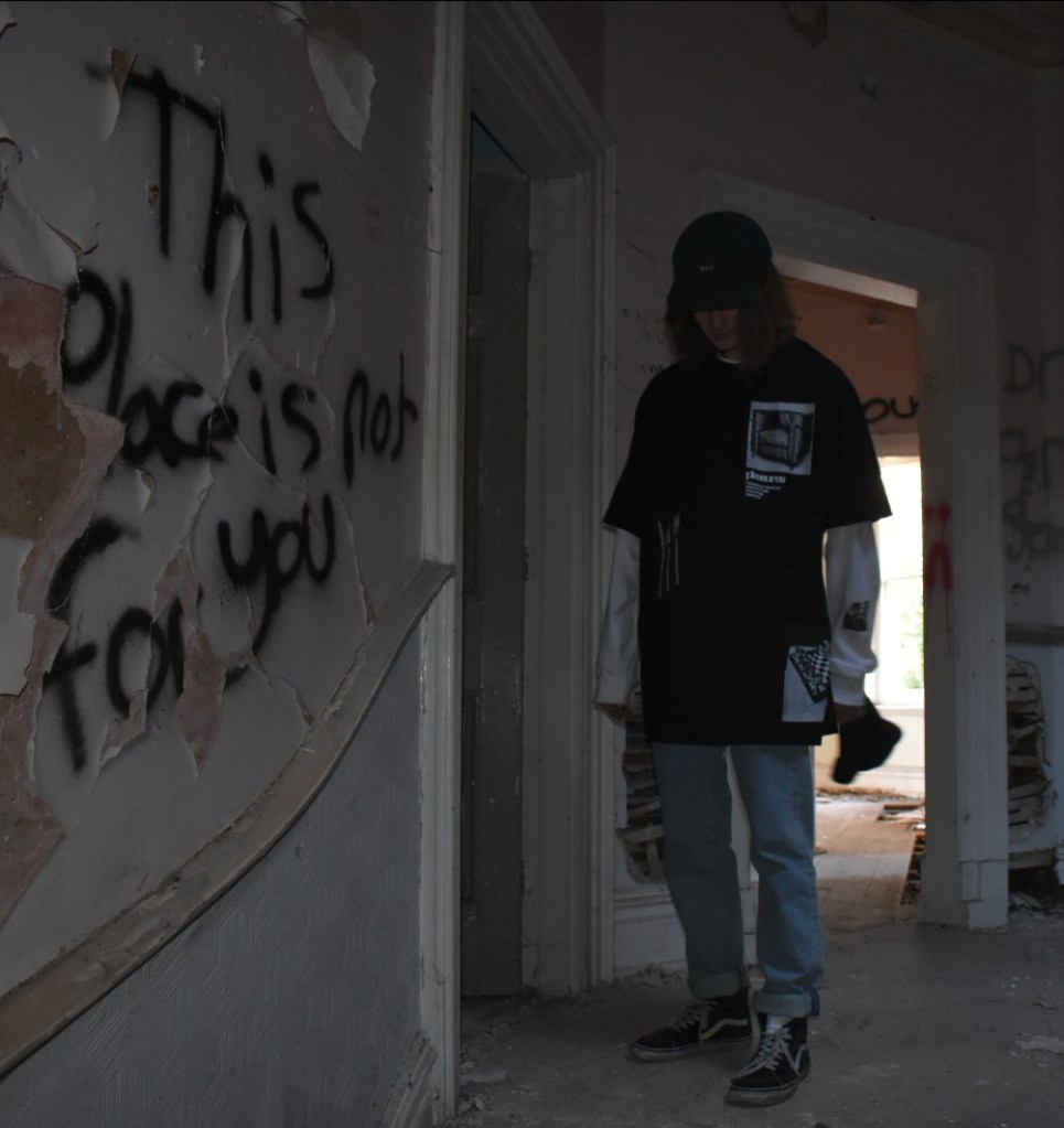
I like the way this image looks moody this is because of how dark this photo is. The graffiti creates a vibe like you’re not meant to be there and that it was a bad place. The door frames focus attention on the subject. This composition also has used diagonal lines to lead the eye to the subject with the wooden rail on the wall.
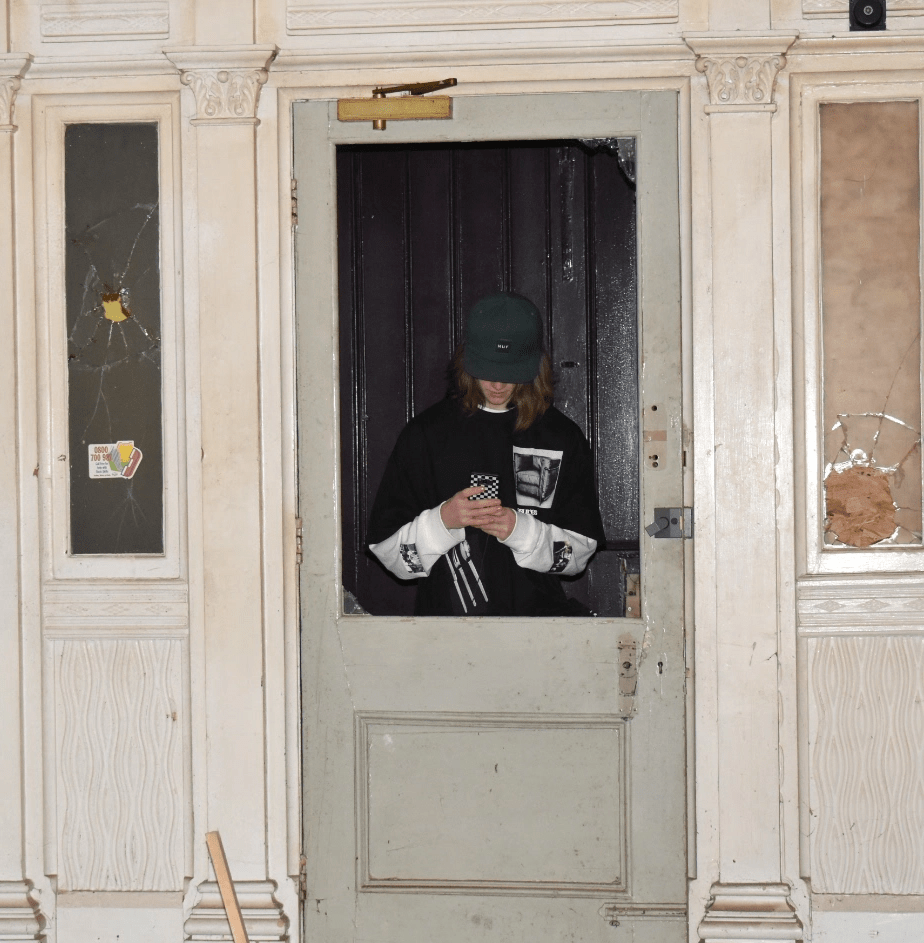
In this image I used the frame in a frame technique and had the subject in the middle of the image so that it becomes the main point of focus. This works particularly well with the square format. The image has repeated vertical lines. The colours are mostly pale shades of green and cream which contrasts with windows and the subjects clothing also drawing attention to the subject. This composition also uses rule of three with the three repeated frames. This image also has a lot of geometric shapes.
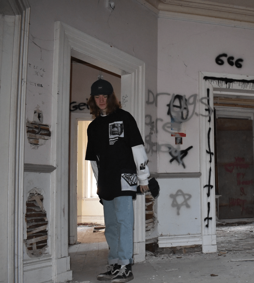
In this shot you can see that the graffiti has a really dark and eerie vibe. I say this because of all the upside down crosses and the 666 plus the stars. Its like someone was trying to summon the devil. This image composition uses frame within a frame. The colours in this shot are pale apart from the subjects clothes which makes the subject stand out. The lines in this image are mostly horizontal and the grey horizontal rail helps lead your eye to the subject.
Circles
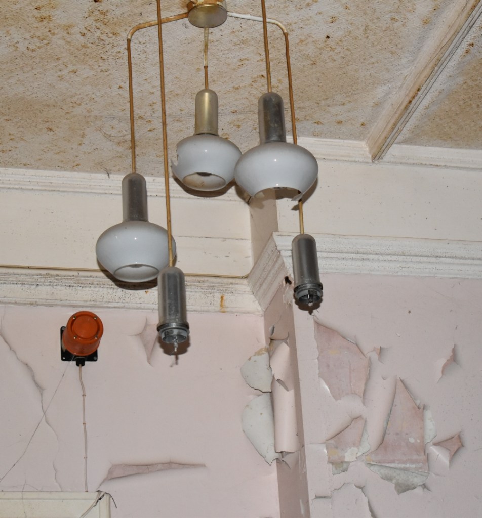
In this photo I like the way the image shows how torn down the building is with the peeling walls. I also like the way the lights dangle and look like they are falling to bits. This image uses geometric shapes and circles which work well with square format. The diagonal lines on the ceiling and coving draw the eye to the centre of the shot where the light fitting is hanging.
Portrait
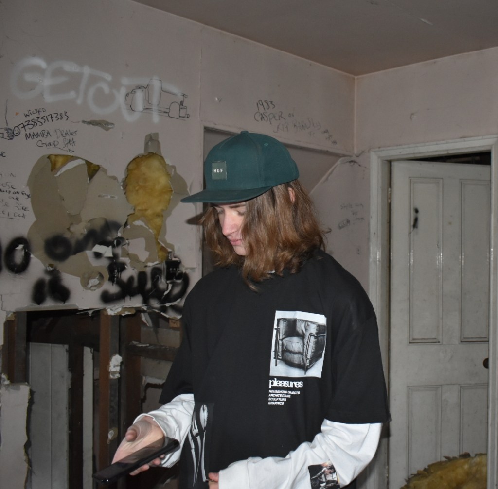
Here I have taken the shot with the subject in the centre. The eyes should really have been a little higher to be in the top third of the image but I still think it is an effective shot. The dark bold clothing of the subject works well against the paler background of the walls. The black and white t-shirt contrasts well with the busy textures and patterns of the derelict wall and graffiti. and the bold logo on the t-shirt really catches the viewers eye.

Here the image has a bold frame in the centre with three lines of rock attached diagonally to the frame which lead the eye to the subject. This shot also has lots of circles and rectangles on the cathedral in the background.
